As I promised, I have managed to write a tutorial (finally) on illustration trying to be as detailed as possible on making a photorealistic replica of an ipod.
Let's get started !
(Note: Click on the images to enlarge)
Step 1
Ok, this step is every designer's dirty little secret :P
Always use a source photo when you try to replicate something that people can recognise from miles away...
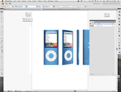
So grab a photo of the ipod (apple's site has excellent shots of the product) and drag it on to illustrator.
Step 2
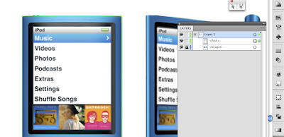
Lock the image layer preventing from accidentally moving it while working on it (just click to the box right next to the little eye on the layer's pallete)
Step 3
Select the Rectangle Tool (M) and make a shape around the body of the ipod (right now the only thing we really want is to match the four corners). Name it "Body" on the layer's palette.
Note: After you choose the right tool, make sure that both foreground/background colour is set to "none", so that you can see beneath the shape.
Step 4
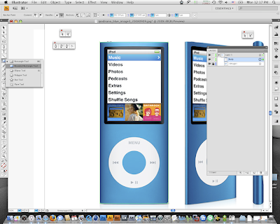
Select the Rounded Rectangle Tool and make another shape to match the display of the ipod. Name it "Screen".
Step 5
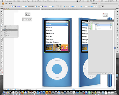
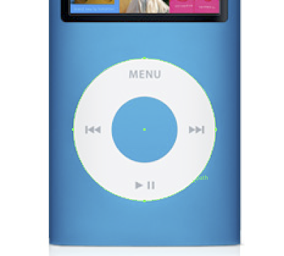
Use the Ellipse Tool (L) and make a perfect circle to match the Clickwheel (tip: hold Shift key while you make the shape to make it a perfect circle and hold Space key when you need to move it around while you design it). Name it "Clickwheel".
Step 6
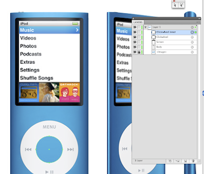
Use the Ellipse tool again to create the inner blue circle on the Clickwheel. Name it "Clickwheel inner".
Step 7
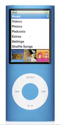
The last shape that we are going to create is the display image. So use the Rectangle Tool to create it. Name it "Screen display".
Step 8
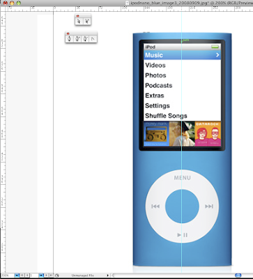
Now, we are going to edit a little bit the body matching the curved lines we seen on top/bottom.
First, turn on the rulers (in case they are not already open) by hitting Command+R (Control+R on a PC). Then create a guide line to the centre of the ipod by clicking and dragging from the left ruler to the centre of the document.
Step 9
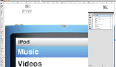
Now pick the Pen+ Tool and having selected the "Body" layer create an additional point where the guideline meets our shape (tip: you can turn on the Smart Guides feature by hitting Command+U (Control+U on PC) as a helper if you want. It will automatically snap in the cross section when your cursor is near)
Step 10
Grab Direct Selection Tool (A), click on the new point and move it a bit upwards so to match the curve on the underlying image.
Step 11
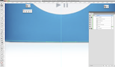
Repeat the same procedure to match the curve on the bottom side of the ipod.
Step 12
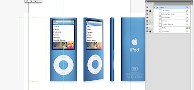
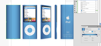
Now we are going to add some colour. Select the "Body" shape (click on to the corresponding little ball-button on the layers pallet) and by holding Shift key press left arrow key on your keyboard to move it on the left side of the image (avoid moving it by mouse so you can bring it exactly where it was after we apply the colour).
Step 13
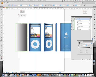
Apply a gradient to the shape (click on the middle little square right below your Foreground/Background colours)
Step 14
We are going to use 3 gradient stops to create the right effect. So, click (and thus add) one more stop on your gradient in the middle of the gradient ramp onto your Gradient palette.
Then just click on the leftmost colour indicator (its little triangle becomes black, so you know it's selected), grab the Eyedropper Tool and by holding Shift key (it is absolutely critical to hold the shift key otherwise when you click on to a colour the shape will become flat coloured) click anywhere onto the left dark-blue shadow of the image.
Then select the middle gradient marker and again by holding shift pick a sample from the middle part of the ipod body (the light blue one).
Finally select the rightmost gradient marker and choose once more the dark blue colour on the right side of the ipod image.
(Note: after choosing the right gradient colours, drag the little diamond-shaped indicators on your gradient ramp to define where the shadow is starting to blend with the main blue colour. See the detail on the image below)
When you finish you must have something like this.
Step 15
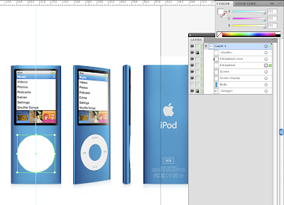
Hide the "Body" layer by clicking onto the little eye icon and select the "Clickwheel" layer. Just fill it with white.
Step 16
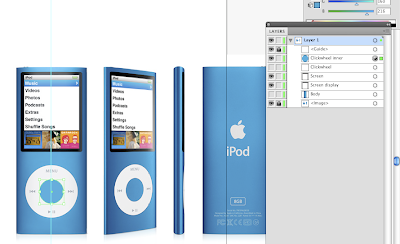
Hide the "Clickwheel" layer and select the "Clickwheel inner" one. Pick the Eyedropper Tool and choose the actual colour from the source photo.
(Note: Rearrange the layer order if needed so that Body is the lower level -above image layer of course-, Clickwheel to be below Clickwheel inner and Screen display below Screen)
Step 17
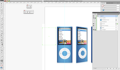
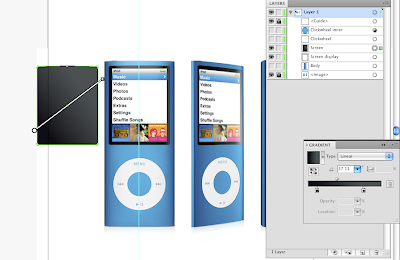
Now we are going to create the shiny black screen border. Select the "Screen" layer and move it to the left by holding Shift key and pressing the left arrow on your keyboard as before.
Step 18
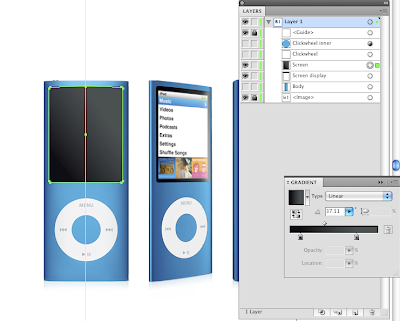
If we notice closely, the black border has a darker tone on the left and bottom part and a lighter one on the right and top. So, we apply a linear gradient with the two tones (which we sample from the picture) and rotate it to match the glossy effect (see my image for details).
Step 19
Move the layer back to its original place by selecting it, holding shift and pressing right arrow on your keyboard until it goes in place.
Step 20
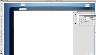
Select the "Screen display" layer and apply a white foreground and a light gray tone. Note that the stroke must be aligned outwards (see detail on my image).
Step 21
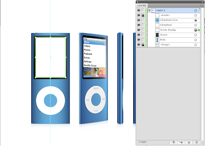
If we enable all layers (turn on the little eye icon on them) we must have something like this...
Step 22
Let's add some shadow to the ipod.
Select "Body" layer and go to Effects-->Illustrator Effects-->Stylize-->Drop Shadow (it can also be accessed through Appearance panel when you click the little "fx" button).
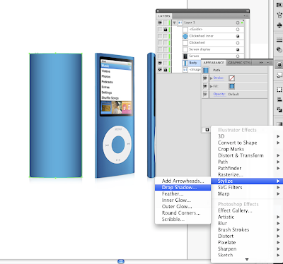
Step 23
Adjust the shadow to match the desired effect (you can use my settings if you like mine)
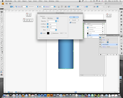
Step 24
Next thing we are going to make is to add a little depth to the Clickwheel.
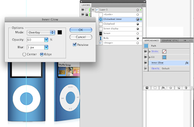
Select the layer and go to Effects-->Illustrator Effects-->Stylize-->Inner Glow.
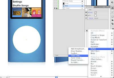
Step 25
Adjust the glow until you have a light gray outline around Clickwheel to add dimension.
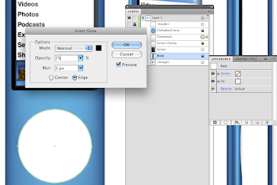
Step 26
We repeat the same procedure to add an Inner Glow to the "Clickwheel inner" layer.
Step 27
Let's create the "MENU" and arrows printings on the clickwheel now.
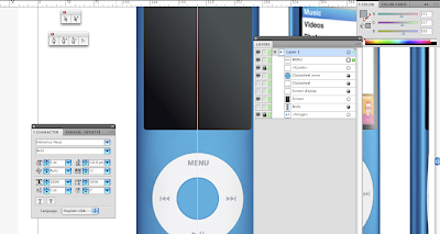
Grab the Text Tool (T), choose a similar font (I have chosen "Helvetica Neue Bold") and write the word "MENU". Adjust it through Character pallete to match the actual letters on the photo and pick the light gray tone from the source.
Step 28
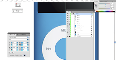
Pick the Pen Tool and create the little gray arrow. Press Command+C and then Command+F (Control for PCs) to duplicate and paste it in front. Move the second layer accordingly to match the design. Finally make the little line.
Step 29
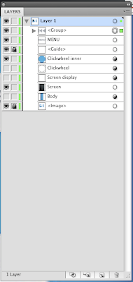
Group the three layers (the two arrows and the line) by holding Shift and clicking on the little ball-buttons on the layers palette and then hit Command+G.
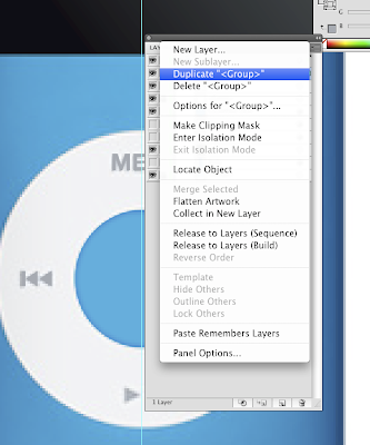
Step 30
Press the little triangle on the rightmost top corner of the layers pallete and Duplicate the group we just made.
Step 31
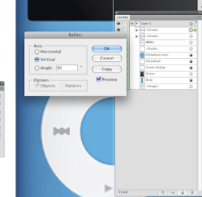
Select the new Group and go to menu Object-->Transform-->Reflect.
Choose "Vertical" and hit OK.
Step 32
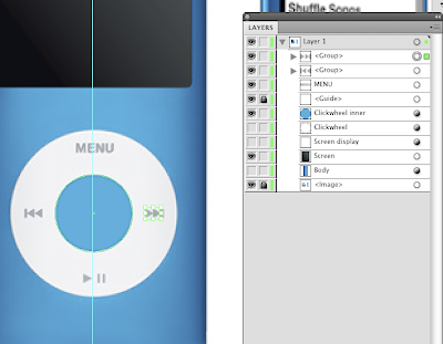
Select the duplicated group and move it in place by holding Shift to remain aligned with the left group.
Step 33
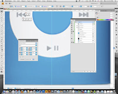
By duplicating a right arrow and two lines create the bottom marks. Then group them.
(Note: to duplicate an element just select it from the layers pallete by pressing the little ball-icon and then Command+C & Command+F (Control key on the PCs))
Step 34
So far, if you enable all layers but the image you must have something like...
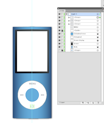
Step 35
We are almost finished!
Go to File-->Place and choose an image to display onto our fresh colourful ipod.
[I have chosen one from the vectors in my Shutterstock portfolio, which I really like and all credits go to Katerina [my girlfriend] who made it and upload it to our joint account :)] [End of adverts :P]
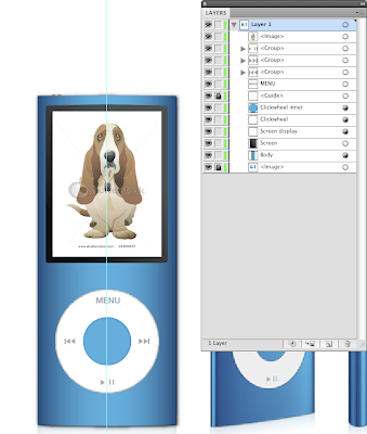
Step 36
Move the display image on top of layers, trash the bottom image layer (source image) and... Voila !
I hope you enjoyed it !



3 comments:
Guys... if you want more tuts on illustrator please leave a comment on what you would like to see here :D
The ipod tutorial was awesome! Its hard to find good tutorials on how to make photorealistic objects.
How would you go about making more complicated objects made of plastic - dust buster or a mouse or anything else related to product design?
thanks!
Hi there!
Thanx for the comment.
Plastic products can be created using the same principle found on this tutorial.
I will make one if you're interested... stay tuned!
Post a Comment